Fifteen chapters.
One brand.
Read it cover to cover, or jump to the chapter you need. Every chapter ends with a "rules" block so the right answer is one scroll away.
The mission, in one sentence.
Reunite a generation with itself.
UbuntuCare exists because diaspora families in the UK shouldn't have to choose between professional childcare and cultural continuity. We are the platform that gives them both.
Mission
To make every family in the UK feel culturally and emotionally safe in the care of someone outside their bloodline.
Vision
By 2031, UbuntuCare is how a million British families experience childcare — not just safer and faster than the system they grew up with, but warmer and truer than they imagined possible.
The four strategic pillars
Cultural fidelity
Every match honours language, heritage, faith, and family tradition. Cultural fit is not a filter — it is the first principle.
Professional rigour
Enhanced DBS, references, identity verification, and safeguarding training. Trust is earned with evidence, not vibes.
Community first
The Village turns the platform into a network. Families meet families. Carers meet carers. No one parents alone.
Operator quality
The product, the brand, the support — every touchpoint feels like a London start-up, not a 1990s council form.
Who we serve — the six communities
- Families. Diaspora and culturally-rooted households across the UK who want care that reflects who they are.
- Carers. Vetted childminders, nannies, and trainee caregivers building a livelihood with dignity.
- Training partners. Academies and colleges feeding a pipeline of certified caregivers into the network.
- Communities. Cultural and faith-based collectives who use UbuntuCare as their care infrastructure.
- Employers. Companies offering workplace childcare benefits to retain diaspora talent.
- Government & local authorities. Councils and ministries partnering on safeguarding, training, and outcomes data.
What we are not
- Not a generic caregiver marketplace. We are a culturally intelligent care network.
- Not a discount childcare app. We are a quality and safety standard.
- Not a saviour brand. We do not "rescue" anyone. We restore something that already belongs to families.
- Not a token diversity gesture. Culture is the product, not the marketing.
One master.
Five focused expressions.
UbuntuCare is the master brand. Beneath it sit four named programmes and one community membership tier — each with its own page and audience but visually unified under the master.
Naming conventions
- The master brand is always written as one word, sentence case: UbuntuCare. Never "Ubuntu Care," "ubuntu care," or "UBUNTU CARE."
- Sub-brands take their own name, never hyphenated to the master: Ubuntu Academy, The Village, For Families, For Carers.
- In a sentence we say "UbuntuCare's Ubuntu Academy" — never "UbuntuCare Academy."
- Legal entity: UbuntuCare Ltd. Use the full legal name only in contracts, T&Cs, and footers.
Sub-brand colour ownership
| Sub-brand | Primary surface | Accent | Voice tilt |
|---|---|---|---|
| For Families | White on Brand Blue | Soft Ivory | Warm, reassuring |
| For Carers | White on Ink Black | Brand Blue | Professional, respectful |
| Ubuntu Academy | Brand Blue on White | Ink Black | Aspirational, structured |
| The Village | Ink Black on Soft Surface | Brand Blue | Familial, conversational |
What we feel like, in 60 seconds.
If a designer or writer has only one page to absorb us, this is that page.
"It takes a village. So we built one."
— UbuntuCare brand statement, locked May 2026
Brand personality
UbuntuCare is the friend who happens to be a midwife. Warm enough to hold your hand, sharp enough to spot what's wrong, calm enough to make you feel safe in any room. Confident without being loud. Cultural without being performative.
Five adjectives
- Warm — never cold, clinical, or transactional.
- Rigorous — every claim is backed by evidence; every promise is backed by checks.
- Culturally fluent — we move between Yoruba, Shona, Punjabi, Somali, Cantonese, and a hundred more.
- Modern — designed for a phone, written for a working parent, built for 2026.
- Familial — we treat carers and families like extended kin, not contractors and customers.
What we sound like in one paragraph
"Care is one of the most intimate decisions a family makes. So we built a platform that respects that. Every carer is enhanced DBS-checked. Every family is matched on values, not just availability. And every conversation is held in the language that feels most like home."
Calm authority.
Familial warmth.
We never raise our voice. We never sound corporate. We sound like the most trusted adult in the room.
The four voice principles
Plain, not simple.
We write in language a tired parent at 11pm can absorb in one read. Short sentences. Real words. No jargon. But never patronising — our reader is intelligent and busy.
Specific, not vague.
"Enhanced DBS" not "fully vetted." "£18 per hour" not "competitive rates." "Yoruba-speaking" not "culturally aware." Specifics earn trust. Vagueness erodes it.
Warm, not soft.
We are kind because we choose to be — not because we are weak. We can say "no," set boundaries, and deliver difficult news without losing warmth.
Cultural, never tokenising.
We name cultures specifically — Akan, Tamil, Igbo, Bengali, Punjabi. We never bundle them under "ethnic" or "multicultural." Specificity is respect.
Dos and don'ts — headline copy
Do
"Care that understands your family."
Don't
"The #1 caregiver platform — sign up now!"
Do
"Tendai taught our boys to greet their grandparents in Shona."
Don't
"Our caregivers come from diverse backgrounds."
Do
"Every carer is Enhanced DBS-checked before they are bookable."
Don't
"All our carers are background-screened for your peace of mind."
Words we use
Carer · caregiver · family · village · home · heritage · language · tradition · trust · evidence · safeguarding · enhanced DBS · reference · identity verified · vetted · matched · culturally aligned · diaspora · community · partnership.
Words we avoid
Babysitter · nanny-share marketplace · ethnic minorities · BAME · multicultural (as a noun) · disruptive · revolutionary · game-changing · best-in-class · world-class · synergy · seamless · unique · empower (as a verb applied to families).
Rhythm rules
- Lead with the answer. The first sentence carries the meaning.
- One idea per sentence. Stack short, then breathe with one longer.
- Read it aloud. If it doesn't sound like a person, rewrite it.
- Never start with "We" twice in a row. Vary subject.
- Avoid the construction "we are not just X, we are Y." It is a tic.
One mark.
Two forms.
The logo is the most disciplined element in the system. Treat it with the respect of a signature. Never recreate it — always pull from the source files.
Primary Wordmark

The U Mark
The "U" letterform is our compact mark — used at mobile sizes, favicons, app icons, social avatars, and as a graphic element.


PNG Application Rules
Always use source PNG files — never screenshot or re-save compressed. We only use slices 6, 7, 9, and 12.
Clear space
Always leave a clear space equal to the height of the dot on all four sides of the logo. Nothing — text, image, edge, or button — enters this zone.
Misuse — never do these
One signature.
A disciplined supporting cast.
Brand Blue carries the brand. Ink Black holds the structure. The neutrals do the quiet work. Status colours are used only for meaning, never for decoration.
Primary
Neutrals
Status
Usage ratio
Across any layout — homepage, ad, deck, app screen — the colour ratio should feel like this:
Brand Blue is the accent — not the wallpaper. If a layout is mostly blue, redesign it.
Accessibility
- Brand Blue (#006FD9) on White passes WCAG AA for body text and controls.
- Brand Blue on Ink Black passes AA — it's the only place we put coloured type on a dark surface.
- Never rely on colour alone to convey meaning. Pair colour with an icon, a label, or a tag.
Two fonts.
Infinite voice.
Manrope Bold carries our headlines. Inter does the heavy lifting everywhere else. Both are free, open-source, and licensed under the SIL Open Font License — production-safe everywhere.
the next generation.
Type rules
- Manrope Bold is for display headlines only. Cover, hero, and large-format moments. Never body.
- Inter does everything else — H1 through caption, button labels, body, navigation.
- Never use more than three sizes in a single composition. Discipline reads as confidence.
- Letter-spacing tightens as size grows. Below 18px, tracking is normal. Above 32px, tracking is negative.
- Line-length cap: 720px. Beyond that, body type becomes hard to read.
- Italics: use sparingly, only for emphasis or quoted speech.
The U is more than a letter.
It's a holding shape.
The U-mark, soft rounded rectangles, dotted patterns, and brand-tint blocks form a small library of expressive elements that signal UbuntuCare without using the logo.
The four element families
- The U-shape. The descender of the wordmark, used as a frame, a container, a punctuation mark.
- Soft rounded rectangles. 10px radius cards, 100px radius buttons. Nothing sharp. Nothing aggressive.
- Dotted patterns. Brand Blue dots at 18% opacity. Used as a texture inside tint blocks or as a connecting motif.
- Tint blocks. Brand Blue at 8–14% opacity. A way to introduce colour without shouting.
Photography overlays
When pairing photography with graphic elements, layer photos at full opacity over Brand Blue tint blocks (8–14% opacity) or anchor them inside clean 10px-radius cards. Never apply Brand Blue as a colour-tint overlay on top of a photo — it kills skin tones. Use Ink Black gradients instead for legibility.
People first.
Always in motion.
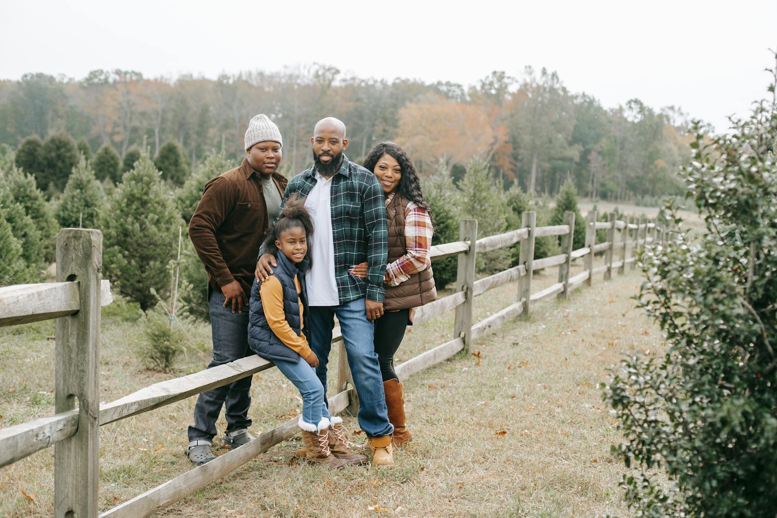
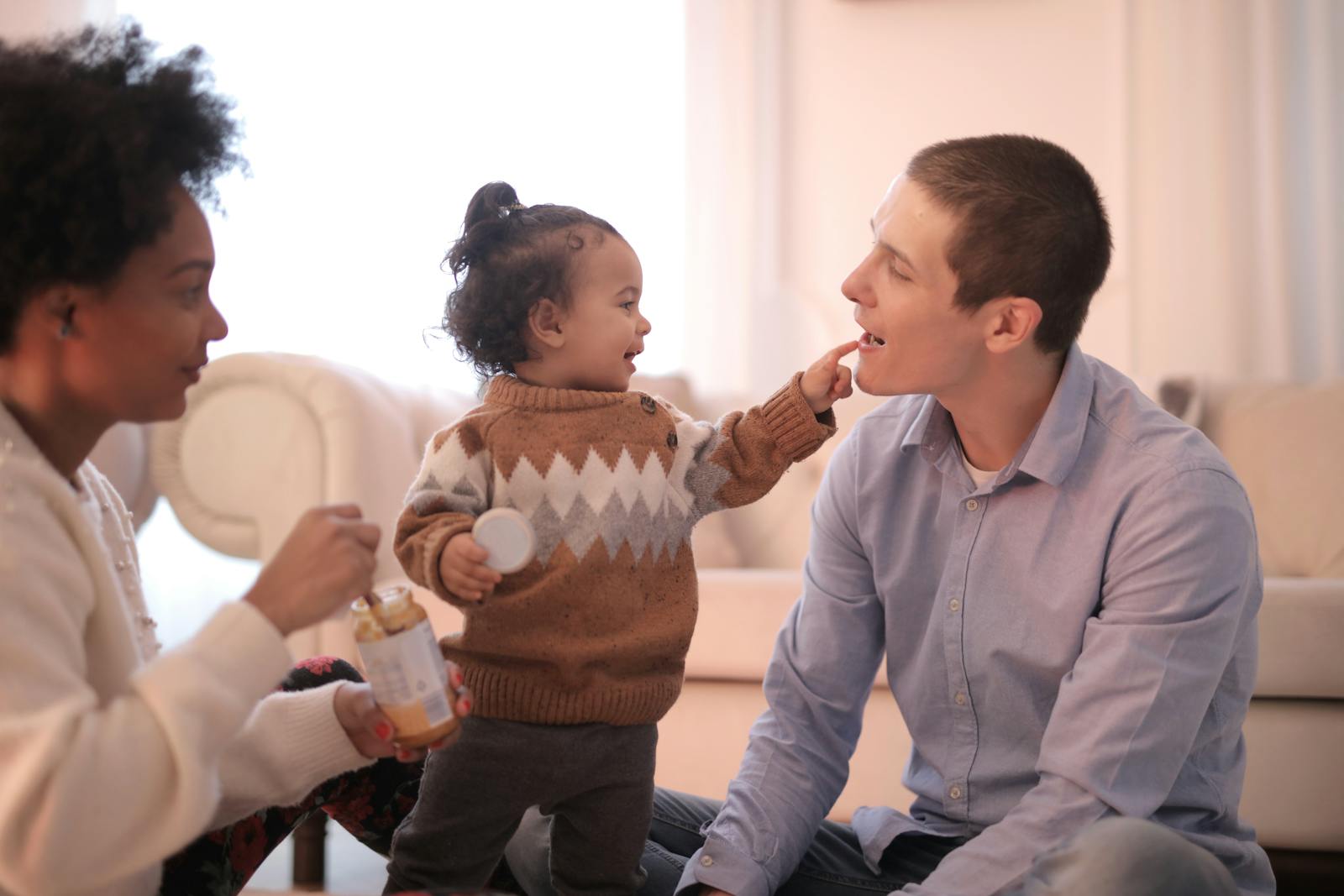
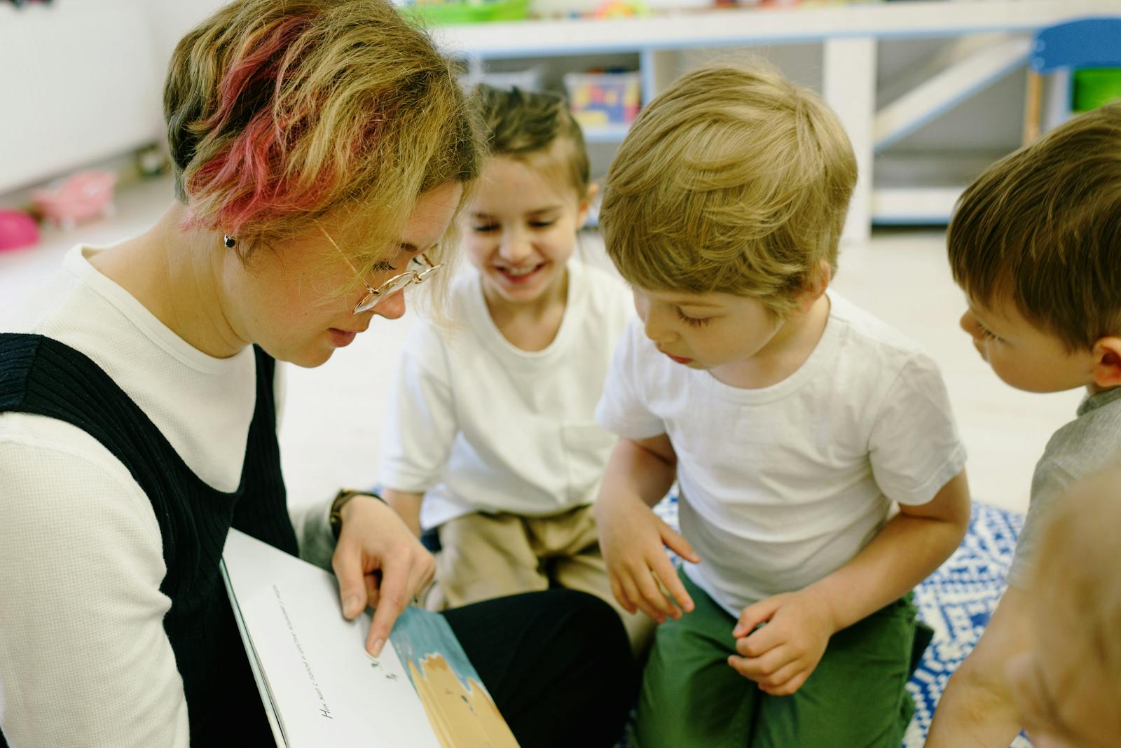
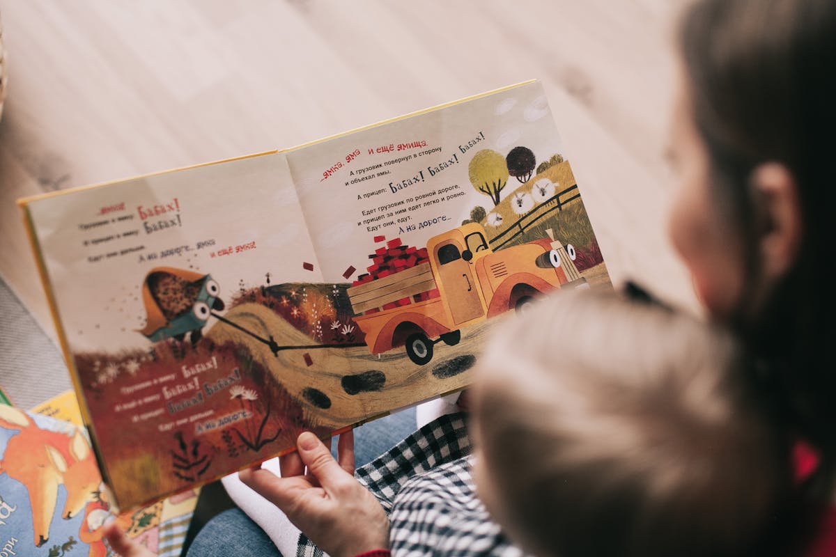
Our visuals show real diaspora families and carers in real British homes — never staged, never generic. Photography is the heart of how UbuntuCare looks. Every image earns its place by showing a moment that could not happen anywhere else.
Subject
- Caregivers and families together — never one without the other.
- Children at play, reading, eating, learning a language, in a faith ritual, hugging a grandparent.
- Specific cultural moments: jollof being stirred, Diwali lamps being lit, a Shona lullaby being sung, hijab being adjusted before school.
- UK settings — Croydon flats, Birmingham terraces, Manchester semis. Never aspirational US suburbs.
Mood
Warm natural light. Soft shadows. Slight overcast where possible. We avoid the over-saturated, over-stylised look of stock photography. Every frame should feel like a moment captured, not a moment composed.
The four visual subjects
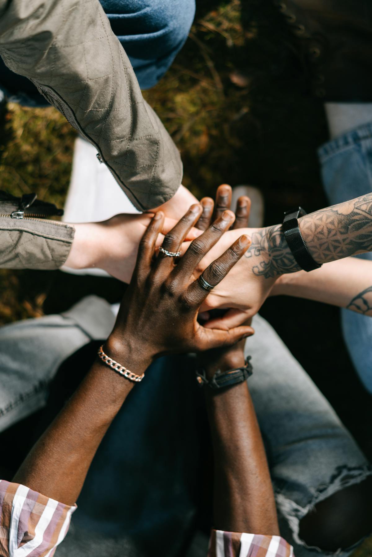
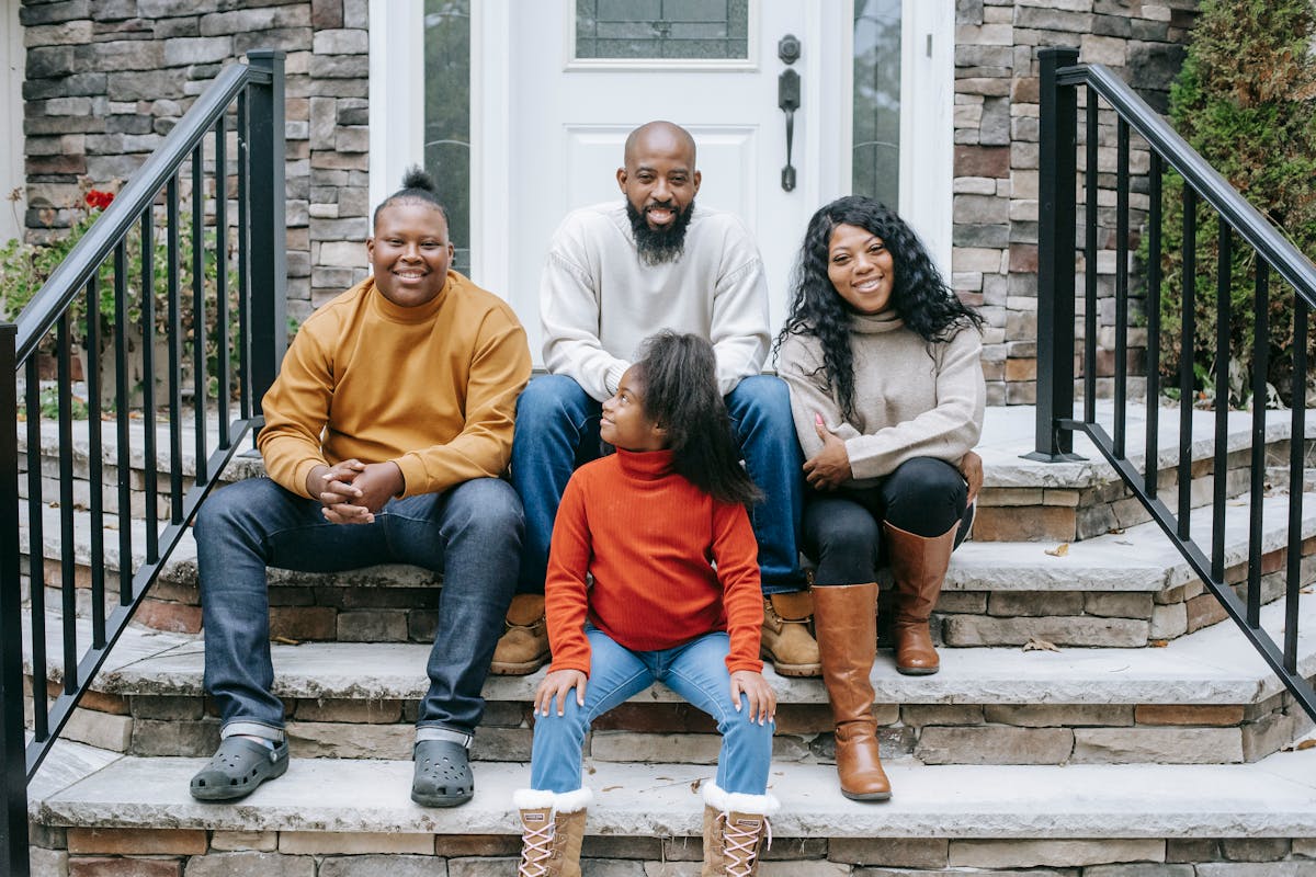
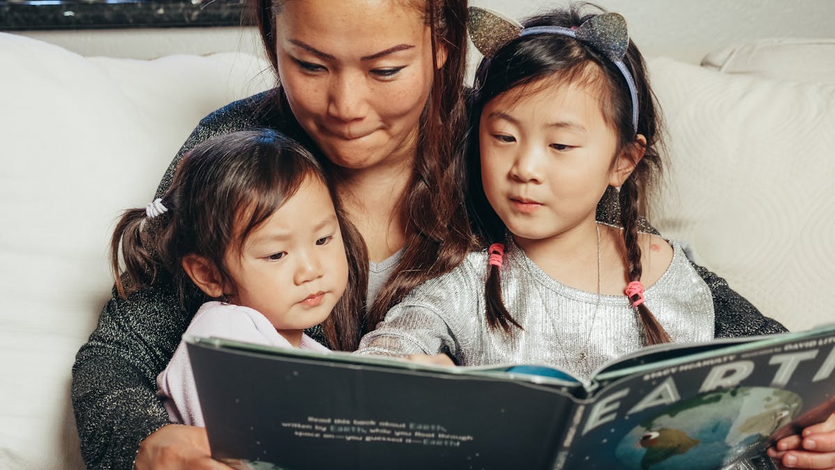
What we don't do
- No stock-photo "happy families" with bleached teeth and matching cardigans.
- No close-ups of caregivers smiling alone — the relationship is always the subject.
- No black-and-white photography. Our brand lives in colour.
- No filters, no heavy retouching, no skin smoothing.
Air over noise.
Always.
Our pages breathe. We use full viewport widths with disciplined internal padding so type can take its space and images can hold their weight.
Spacing scale
Container rules
- Containers are always 100vw. Padding lives inside.
- Mobile:
20pxhorizontal padding. Desktop (≥768px):40px. - Text content max-width:
720pxfor body,880pxfor hero headlines. - Sections separate through contrast shifts, with page gutters controlled by
--pad.
Radii
| Token | Value | Use |
|---|---|---|
--r | 10px | Forms, inputs, small surfaces |
--r-card | 10px | Cards, grid panels, custom containers |
--r-button | 100px (pill) | Buttons, switches, tags, interactive controls |
--r-pill | 100px | Pill badges, toggles, active indicators |
Shadows
| Token | Value | Use |
|---|---|---|
--shadow-1 | 0 1px 2px rgba(0,0,0,.04), 0 4px 12px rgba(0,0,0,.04) | Resting cards |
--shadow-2 | 0 8px 32px rgba(0,0,0,.08) | Hover, lifted elements |
--shadow-elevated | 0 16px 48px rgba(0,0,0,.12) | Modals, drawers, overlays |
Calm motion.
Never anxious.
Motion is a quiet host. It shows what's interactive, where attention should go, and what just changed — without showing off.
Fade-up
0.5s ease. Used for hero text and section entry. Stagger by 100ms for sequences.
Drift
2s ease in/out, infinite. Used for ambient brand elements — metric cards and focused state changes.
Scale pulse
Press feedback. Buttons scale to 0.99 on :active. Stop animations on reduced-motion.
Motion principles
- Purposeful. Every animation explains a change. Decorative motion is banned.
- Fast. Most transitions are 150–200ms. Reveals up to 500ms. Anything longer feels heavy.
- Easing.
cubic-bezier(0.4, 0, 0.2, 1)for entrances.easefor everyday transitions. - Respect prefers-reduced-motion. Always provide a still alternative.
One style.
Stroke, not fill.
All icons are 24×24px stroked outlines at 2px weight, round caps, round joins. We use the Lucide icon set as our canonical library. Custom icons must match this style precisely.
Icon rules
- 24×24px viewBox, 2px stroke, round caps and joins.
- Use
currentColorso icons inherit text colour automatically. - Icons sit inside a tinted 48px square —
brand-tintbackground, brand-blue stroke — at standard size. - No mixed styles. No fills. No two-tone icons. No emoji as icons.
The pieces
that build everything.
Components are the lowest layer of the design system. Every page is assembled from these. Build them once. Use them everywhere.
Buttons
Tags
Forms
Cards
Standard card
10px radius, 1px hairline border, 24px padding. The default container for any grouped content.
Dark card
Ink Black surface. Used for emphasis blocks, investor sections, and the bottom-of-page CTA.
Choice tiles
Empty state
Nothing here yet
When a family books with you, their request will appear in this list.
Words that are
already true.
A working library of taglines, CTAs, and standing copy that's been pressure-tested against the voice principles. Use these directly. Adapt only if you must.
Brand statements
- "It takes a village. So we built one."
- "Care that understands your family."
- "Together, we raise the next generation."
- "Trusted carers. Devoted families. One village."
- "Care, the way it was always meant to be — held by the community that knows you."
Headlines
- "Carers who feel like home."
- "The UK's culturally intelligent care network."
- "Designed around who you are — not just where you live."
- "Care, in the language your child dreams in."
CTAs
- "Get started" — universal sign-up
- "Join the waitlist" — pre-launch
- "Find a carer" — family-facing
- "Apply as a carer" — caregiver-facing
- "See the standard" — safeguarding / vetting
Standing copy — vetting promise
"Every carer is Enhanced DBS-checked, references-verified, identity-confirmed, and safeguarding-trained before they appear on the platform. We don't take shortcuts. Neither do you."
Standing copy — cultural promise
"Match by language, heritage, faith, and family tradition. Whether you're Yoruba, Shona, Punjabi, Cantonese, Somali, Akan, or somewhere in between — your child grows up seen."
Standing copy — the village promise
"The Village isn't a marketing term. It's a real community of families and carers who share meals, mind each other's kids on a Saturday, and show up. Joining UbuntuCare means joining people who recognise you."
Take it with you.
Everything you need to brand-correctly produce a deck, a poster, a contract, or a press release. If something is missing, email admin@ubuntucare.uk.
Logo — wordmark (blue)
Primary wordmark in Brand Blue + Ink. Scalable SVG.
Logo — white
White wordmark for dark backgrounds and photography.
Logo — on brand
White wordmark sized for Brand Blue backgrounds.
U Mark
Compact mark for favicons, app icons, social avatars.
Manrope (display)
Google Fonts — download all weights or embed via link tag.
Inter (body)
Google Fonts — 400/500/600/700/800/900 weights used.
Need something else?
Press, partnership, or custom assets — email the brand team.